Chuck Crush reads as a puzzle game with a quicker pulse than most calm grid puzzlers.
The current public-safe screenshots do not show the full board in action, but they still make the game’s direction easy to read:
- the game is built around short runs rather than long setup
- the visual language is sharp, loud, and unapologetically game-like
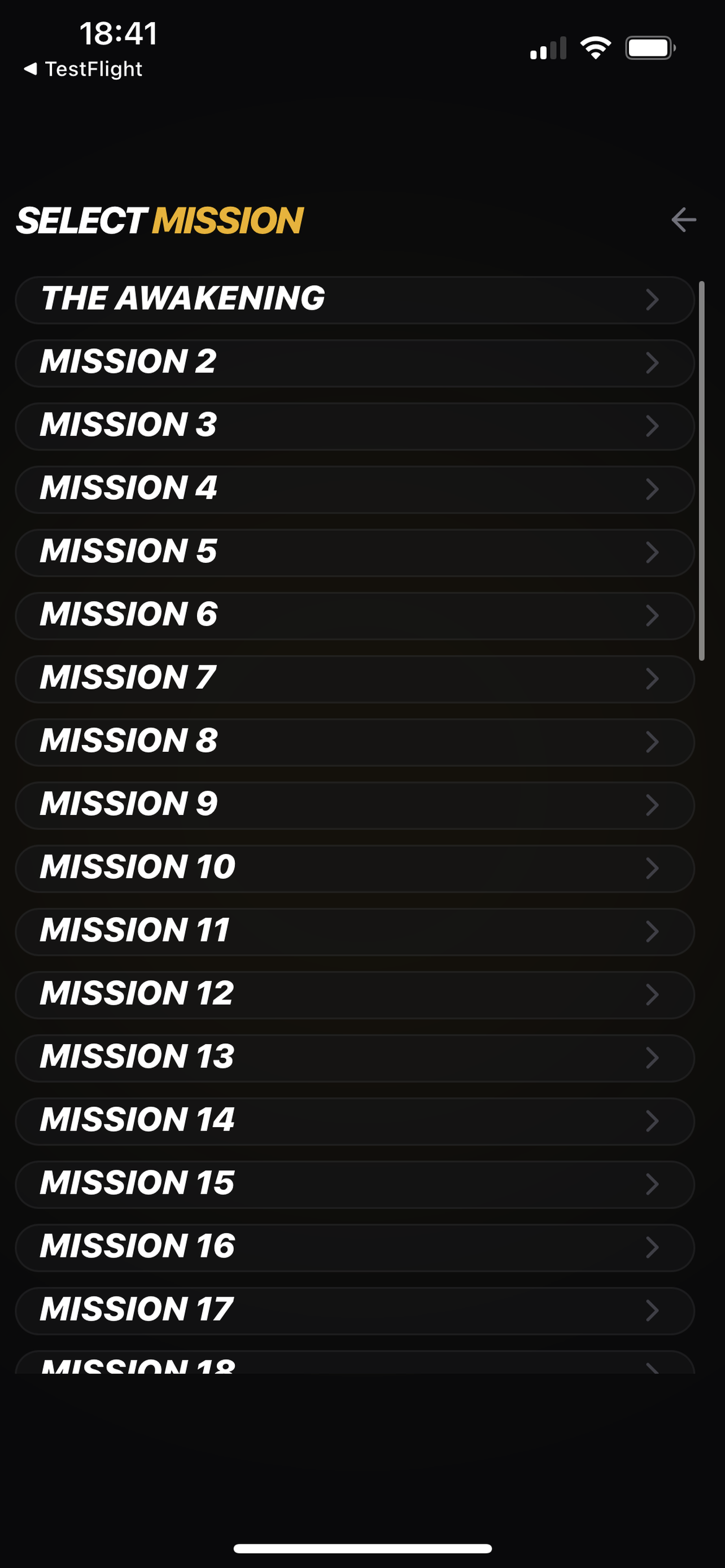
- missions and progress screens suggest that each round belongs to a larger structure
A faster mood from the first tap
Some puzzle games want to feel tidy and quiet. Chuck Crush appears to want the opposite. The icon, the colors, and the screen design all point toward something more urgent.
That matters because players often know within seconds which kind of puzzle game they are looking at. Chuck Crush signals speed early, even before you break down rules or systems.
The round seems built for quick reads
Even without the full active-board screenshot in the public-safe set, the game already suggests a clear loop:
- get into a mission quickly
- play under visible pressure
- come back with a reason to do better next time
That makes Chuck Crush feel closer to an arcade puzzle run than to a relaxed logic exercise.
Why the settings screen matters here
The settings screen is not just a technical menu. It tells you what kind of game this is.
When a puzzle game exposes audio, haptics, and VFX clearly, it usually means feedback is part of the experience. Chuck Crush seems to care about how moves land, not just whether they are correct.
What the current safe screens already confirm
The strongest visible gameplay signals right now are:
- a mission ladder instead of a blank start screen
- progression tracking instead of disposable rounds
- a settings page built around feel and presentation
That is enough to understand the intended style of play, even before a fully safe gameplay crop is added.